Logo & Identity
Helsingør Kommunes Beredskab

Logo & Identity
Helsingør Kommunes Beredskab
Client
Helsingør Kommunes Beredskab
Industry
Fire Department
Services
Logo design
Art Direction
Identity design
Badge design
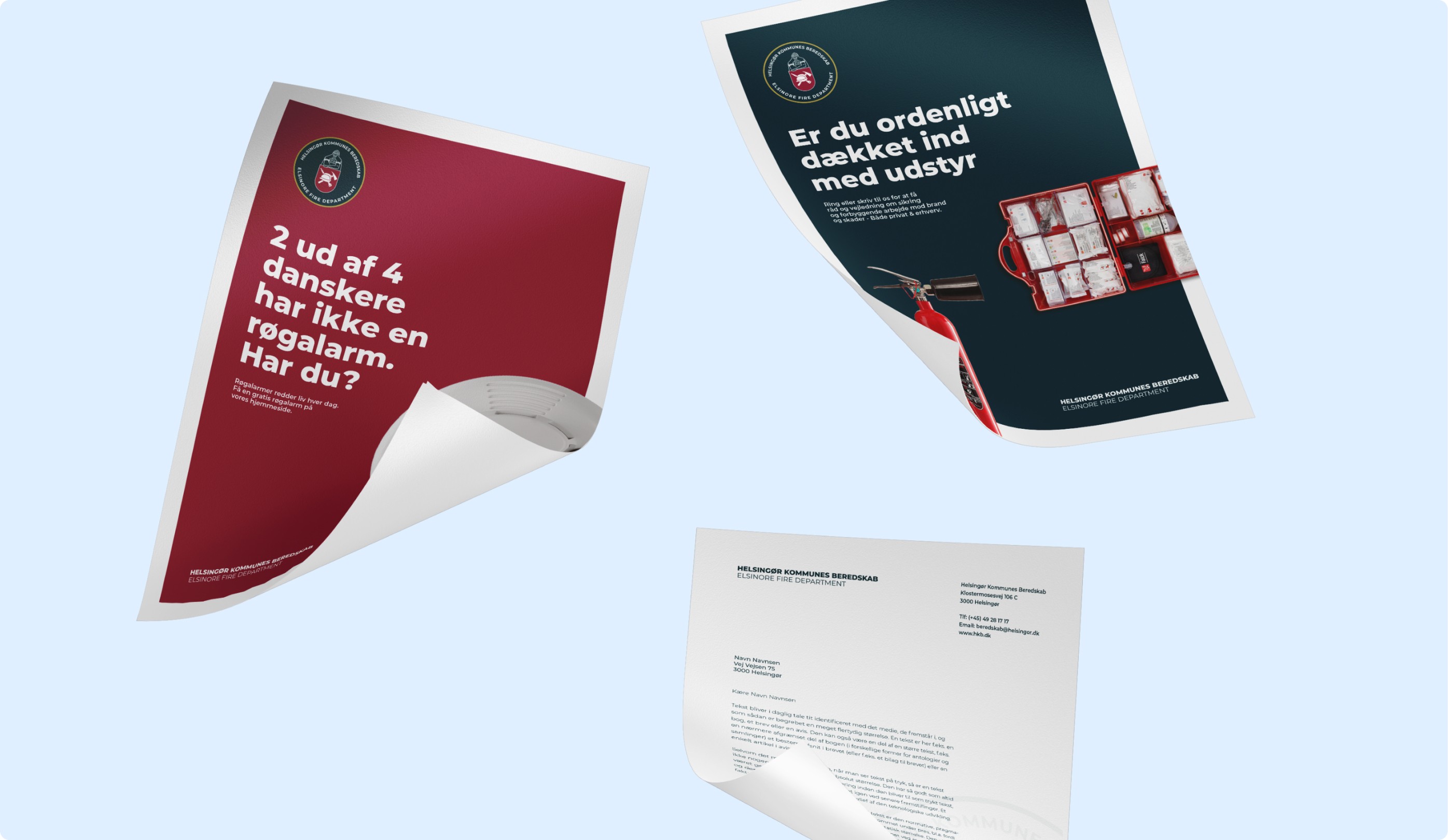
Print materials
Year
2022
Introduction
Helsingør Kommunes Beredskab is the official firefighting and rescue service for the municipality of Helsingør. With a mission to prevent and combat fires, as well as conduct rescue operations when people or property are in danger, the service operates across four fire stations located in Helsingør, Espergærde, Tikøb, and Hornbæk. Serving approximately 65,000 citizens, Helsingør Kommunes Beredskab is on call 24/7, ensuring the safety and well-being of the local population. As a critical emergency service, the Beredskab wanted to establish a strong and independent visual identity that reflects its authority and dedication.
Challenge
The primary challenge was that Helsingør Kommunes Beredskab’s visual identity was tied to the official municipal logo, which didn’t effectively differentiate the fire service as an independent and authoritative rescue organization. The logo lacked the international recognition typically associated with emergency services, particularly the round badge format used by rescue corps worldwide. Additionally, the logo did not translate well into English, limiting its usage in international contexts. The need was clear: Helsingør Kommunes Beredskab required a unique, recognizable logo that represented its core functions and could establish credibility both locally and globally.
The primary challenge was that Helsingør Kommunes Beredskab’s visual identity was tied to the official municipal logo, which didn’t effectively differentiate the fire service as an independent and authoritative rescue organization. The logo lacked the international recognition typically associated with emergency services, particularly the round badge format used by rescue corps worldwide. Additionally, the logo did not translate well into English, limiting its usage in international contexts. The need was clear: Helsingør Kommunes Beredskab required a unique, recognizable logo that represented its core functions and could establish credibility both locally and globally.
The primary challenge was that Helsingør Kommunes Beredskab’s visual identity was tied to the official municipal logo, which didn’t effectively differentiate the fire service as an independent and authoritative rescue organization. The logo lacked the international recognition typically associated with emergency services, particularly the round badge format used by rescue corps worldwide. Additionally, the logo did not translate well into English, limiting its usage in international contexts. The need was clear: Helsingør Kommunes Beredskab required a unique, recognizable logo that represented its core functions and could establish credibility both locally and globally.
Insight & Solution
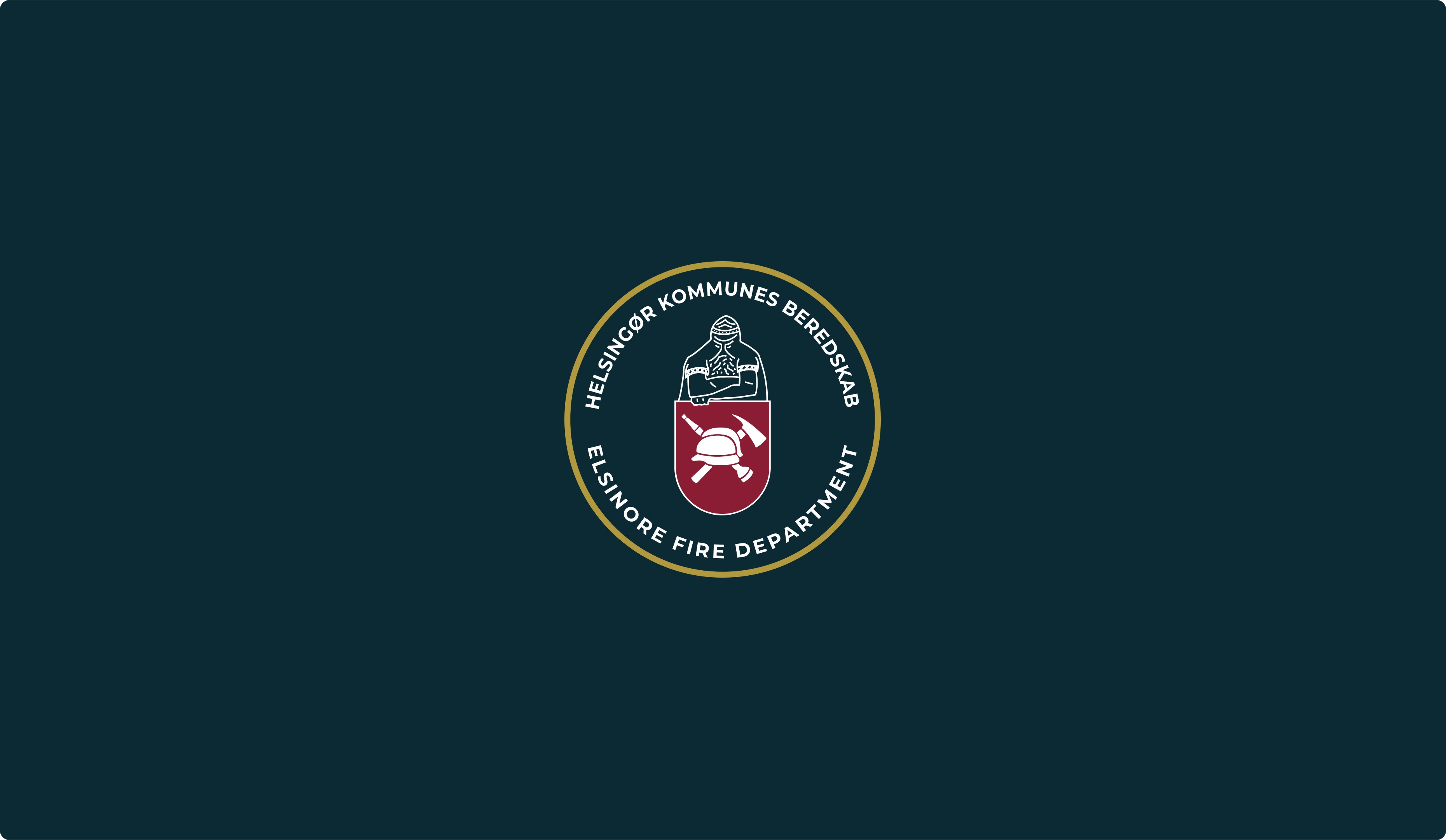
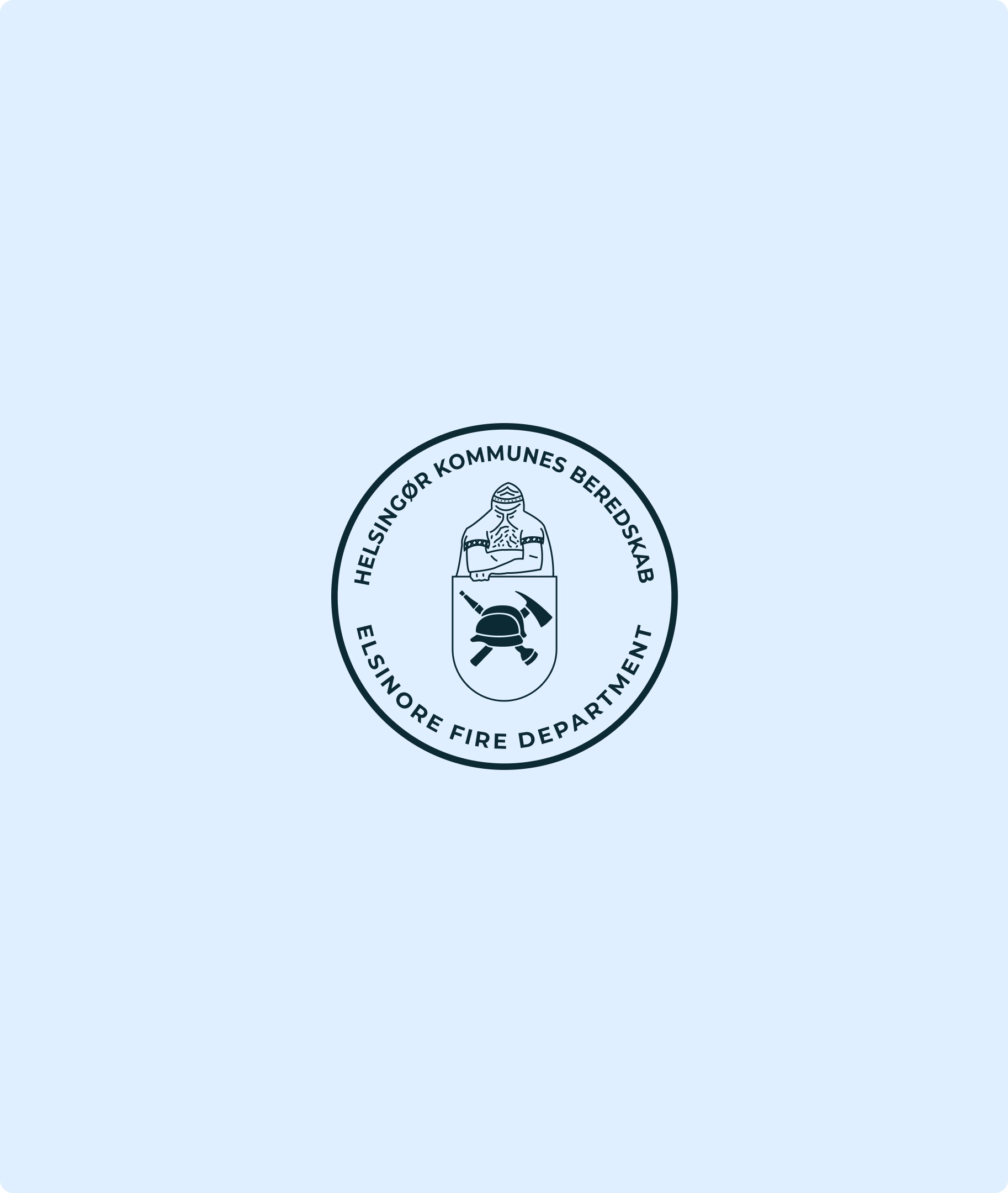
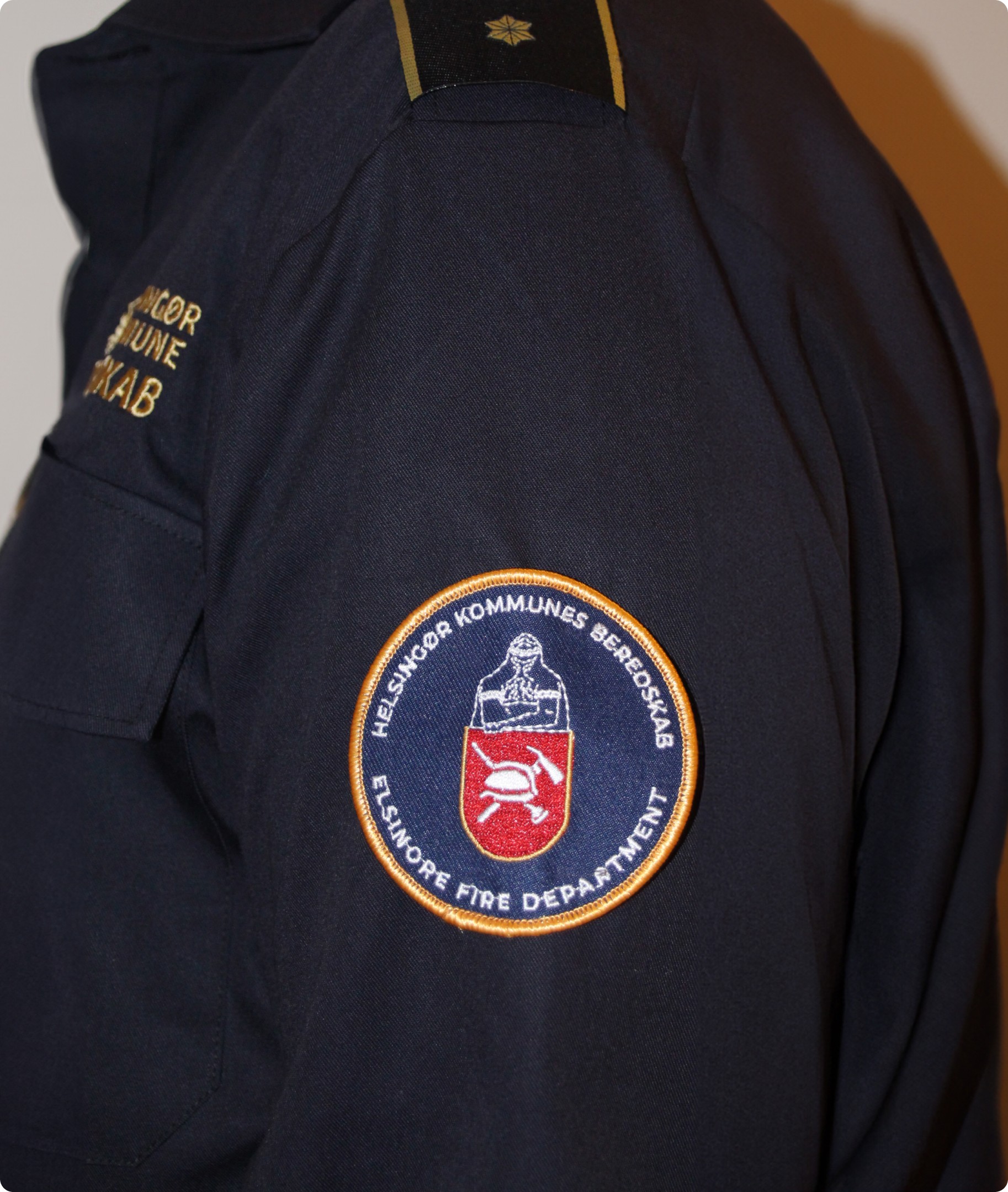
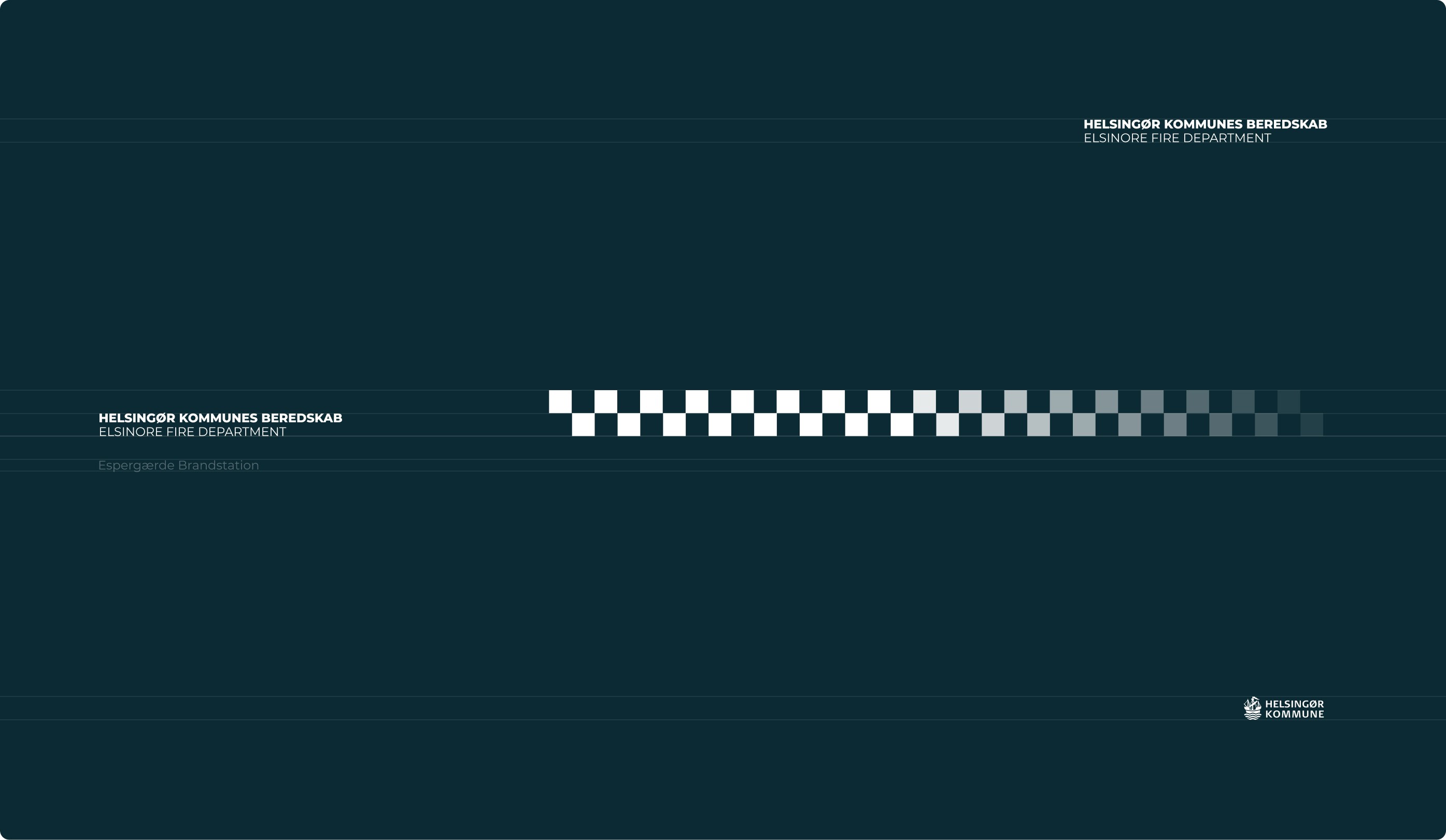
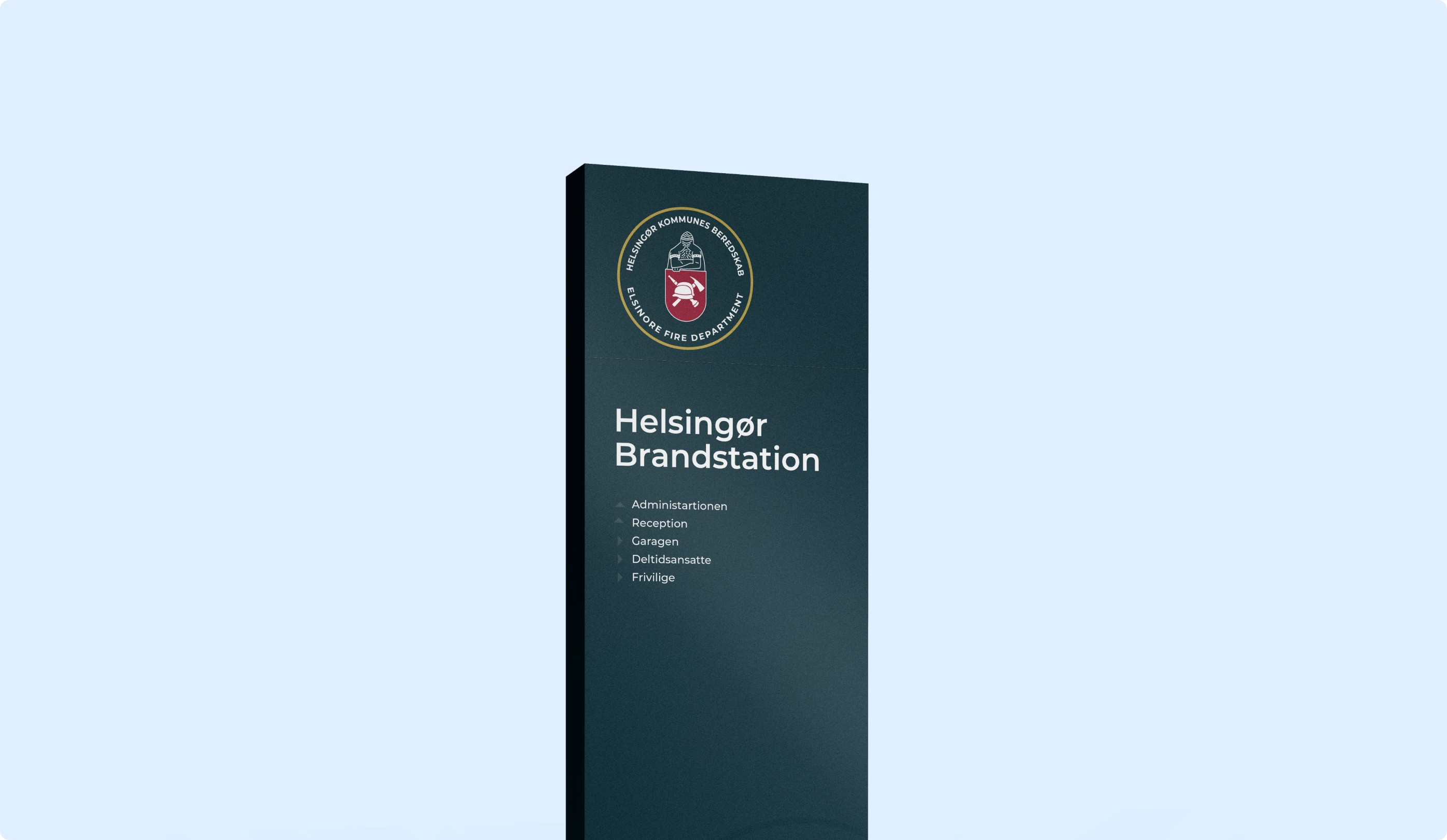
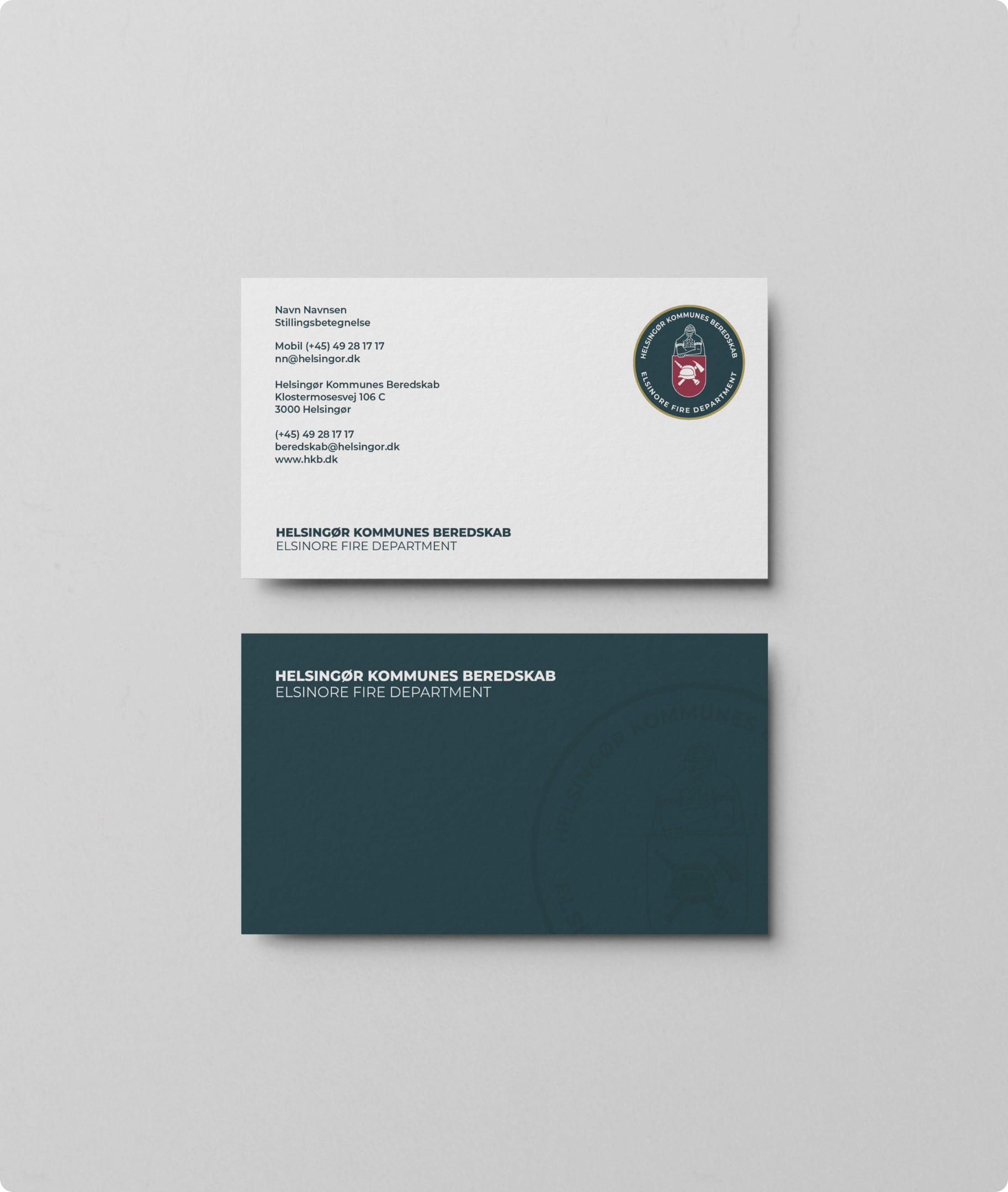
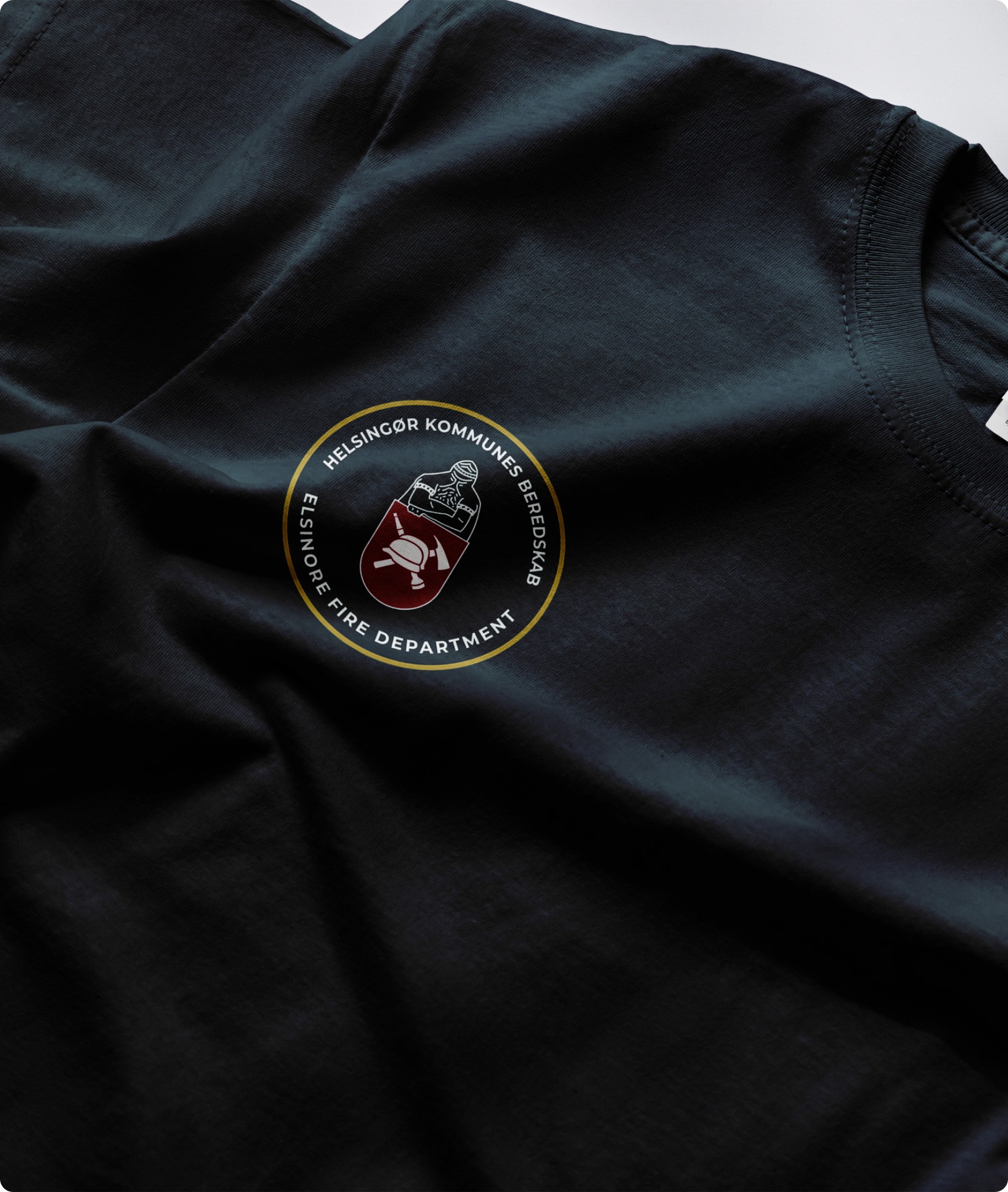
The solution was to design a distinctive, round badge logo, a globally recognized symbol of official rescue services. The new logo would serve as a clear representation of Helsingør Kommunes Beredskab’s authority and professionalism, both online and offline. Inspired by the legendary figure Holger Danske, who is said to guard over Helsingør, the logo symbolized the Beredskab’s role as the protector of the community. The design was further enhanced with a color scheme rooted in both practicality and symbolism: a blue primary color, drawn from the official municipal blue, to tie the service back to the local government; a bold red, symbolizing fire and the core mission of firefighting; and a touch of gold, representing authenticity, trust, and reliability.
The solution was to design a distinctive, round badge logo, a globally recognized symbol of official rescue services. The new logo would serve as a clear representation of Helsingør Kommunes Beredskab’s authority and professionalism, both online and offline. Inspired by the legendary figure Holger Danske, who is said to guard over Helsingør, the logo symbolized the Beredskab’s role as the protector of the community. The design was further enhanced with a color scheme rooted in both practicality and symbolism: a blue primary color, drawn from the official municipal blue, to tie the service back to the local government; a bold red, symbolizing fire and the core mission of firefighting; and a touch of gold, representing authenticity, trust, and reliability.
The solution was to design a distinctive, round badge logo, a globally recognized symbol of official rescue services. The new logo would serve as a clear representation of Helsingør Kommunes Beredskab’s authority and professionalism, both online and offline. Inspired by the legendary figure Holger Danske, who is said to guard over Helsingør, the logo symbolized the Beredskab’s role as the protector of the community. The design was further enhanced with a color scheme rooted in both practicality and symbolism: a blue primary color, drawn from the official municipal blue, to tie the service back to the local government; a bold red, symbolizing fire and the core mission of firefighting; and a touch of gold, representing authenticity, trust, and reliability.










Ready to make your brand shine?
Book a call with Mathias

Wanna talk
Where to find us
Havnegade 39
1058 Copenhagen
Denmark

© Smile Branding Studio™
Made with a smile
Ready to make your brand shine?
Book a call with Mathias

Wanna talk
Where to find us
Havnegade 39
1058 Copenhagen
Denmark

© Smile Branding Studio™
Made with a smile
Ready to make your brand shine?
Book a call with Mathias

Wanna talk
Where to find us
Havnegade 39
1058 Copenhagen
Denmark

© Smile Branding Studio™
Made with a smile

